Because the Earth is a sphere, it doesn’t translate well to a two dimensional, square map. Because of the issues in projecting a 3D sphere on a 2D map, no 2D map can be entirely correct – choices must be made.
The primary map model of the Earth we all learned in school is the Mercator Projection which was created by Gerardus Mercator in 1569. Here’s a version of the Mercator map:

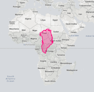
What is wrong with the Mercator Projection map? Most of us have no idea how big major land masses are as compared to each other because the Mercator map distorts the size of countries near the poles. For example, Greenland looks to be about the size of Africa? How big are their relative sizes? Here’s what Greenland would look like if placed on top of Africa:
Other major distortions of the Mercator Projection:
- Alaska looks about as big as the continental U.S. (its about 1/3rd as big)
- Europe and South America look similar in size (South America is about twice the size of Europe).
Why was the Mercator Projection created? It preserves directional bearing making it a useful tool for navigation (by boat, without GPS).
An alternative to the Mercator Projection is the Gall-Peters Projection and is basically the Mercator Projection altered to make the land masses the correct size relative to each other. It looks pretty strange given how used to the Mercator map we are:

There are other versions of projections beyond Gall-Peters. Here’s the Authagraph projection which can be folded up into a 3D globe and is being used quite a bit in Japan:

Another interesting thing is realizing that the Earth is a sphere out in the middle of space and there is no reason why maps should show the north as being “up.” In ancient civilizations and even prehistoric times maps often had the east facing up because that is where the sun rose. North is shown as “up” because European map makers, including Mercator, decided it made sense. Here’s a map with the south facing up.

Here’s part of an episode the the TV Show “The West Wing” where cartographers try to get the President to support legislation supporting the teaching of Gall-Peters over the Mercator:


Great IFOD- and love the west wing clip. I think schools should teach all these map versions! We live in a connected world with so much more access for correct images and google earth- why not have better 2D maps, or at least more perspectives.